About GIST
Creating limitless possibilities through research and education
GIST UI
Logo
The four rectangular pillars represent the pursuit of globalization (Global) with innovative thinking (Innovative) and the leadership in science and technology (Technological) through scientific research (Scientific).
- The red color of the 'G' signifies dynamism, passion, strength, and ambition, while the gray color represents 'autonomy.' In particular, the red color evokes the color of GIST buildings, emphasizing GIST as a representative educational institution in Gwangju.
- The tiered arrangement of the letters, G, I, S, and T, signifies a gradual leap towards globalization and the vibrancy of youth.
Color Application
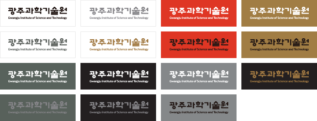
The basic principle for applying the colors of the logo is not to use a background color. However, if it is unavoidable, it can be used as illustrated below.
The use of colors should adhere to the designated colors, and when a background color is used, the logo must be clearly shown.
The application of the logo colors should ideally be produced in two designated colors. However, if a single color must be used, it can be used as illustrated below. The logo is the most important element that forms the foundation of the GIST logo and mark system.
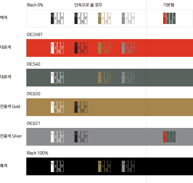
The Color Application Image
- single colored and basic form
- White: Black 0%
- Core Colors: DIC 2497, DIC 540
- Designated Color (Gold): DIC 620
- Designated Color (Silver): DIC 621
- Black: Black 100%
English Media Mark
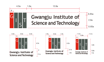
The symbol, represented by the initials of the "Gwangju Institute of Science and Technology," is primarily used for external communication. The designated core colors are used.
Korean Media Mark
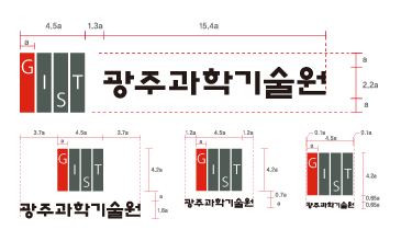
The symbol, represented by the initials of the "Gwangju Institute of Science and Technology" and crafted to be read as it sounds in Korean, is primarily used for external communication. The logo design utilizes the unique typography of GIST and the designated core colors.
Logotype
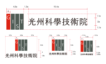
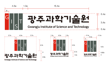
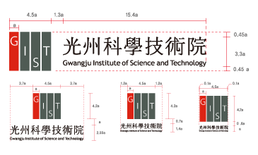
The logotype, along with the logo, is one of the key elements forming the core of GIST’s University Identity Standards (U.I.S.). Having been designed considering its unity and combination with the logo, it must not be arbitrarily altered under any circumstances. The logotype should be used as stated in the manual. If it’s not possible, however, it must be accurately produced according to the grid scale proportion regulations.
The Color Application
Emblem
The emblem, designed using the logo and logotype, can be used when a decorative effect is needed. The colors can be freely used within the range of the primary and designated colors specified in the manual. The content, such as a slogan, can be differently expressed on the edge part as needed. Special attention must be paid to ensure that the basic image shown below is maintained.


20th Anniversary Emblem
The emblem introduced here was designed to commemorate the 20th anniversary of GIST and was used as part of GIST's visual identity system throughout the year of 2013.
The emblem can be used either in conjunction with the GIST logo or independently, with the decision on independent use based on the audience and the nature of the application.
30th Anniversary Emblem
The emblem introduced here was designed to commemorate the 30th anniversary of GIST and was used as part of GIST's visual identity system throughout the year of 2023.
The emblem can be used either in conjunction with the GIST logo or independently, with the decision on independent use based on the audience and the nature of the application.
Signature
The signature defines the combination standards of the logo and logotype of GIST. The position and size proportion of the logo and logotype should refer to the provided examples, and the spacing between the logo and logotype must strictly adhere to the specified proportions.
Designated Colors
The designated colors represent GIST and consist of core and special colors. The principle is to use the specified colors, and even colors of the same family that are not specified must not be used. The reproduction of the designated colors should ideally use spot colors, but if spot color printing is not possible for newspapers, magazines, promotional materials, etc., the printing regulations for the specified CMYK ratios must be followed.


